
Give an AI Agent a single requirement, and within minutes it can produce a front-end page: tidy layout, balanced colors, complete components, and almost nothing obviously wrong. It also carries a strong AI flavor.
That is exactly what makes designers uncomfortable.
This kind of "nothing obviously wrong" does not come from design judgment. It comes from a model averaging a massive number of interfaces: which cards appear most often, which spacing feels safest, and which colors rarely cause problems. Here, "perfect" is defined by the model. It means "close to the average of many correct-looking pages," not "judged for this specific situation."
Human-led design starts from a different place: who the page serves, which information must be seen first, and when the interface should deliberately contain nothing. These questions have no average answer. They require specific judgment.

Our team recently completed two product design projects entirely with Agents. In the retrospectives, one pattern stood out: the design documents recorded less about "what we made" and more about what we stopped: polished defaults that looked perfect but failed under scrutiny.
Here are three field cases:
-
How to design numbers that move
-
How to design a confirmation flow
-
The working order of page design
Scene 1 | Motion must serve information: beware unsupported "pseudo real-time" signals
Context and the default answer
A homepage needs to establish credibility, and a set of statistical numbers is a common solution.
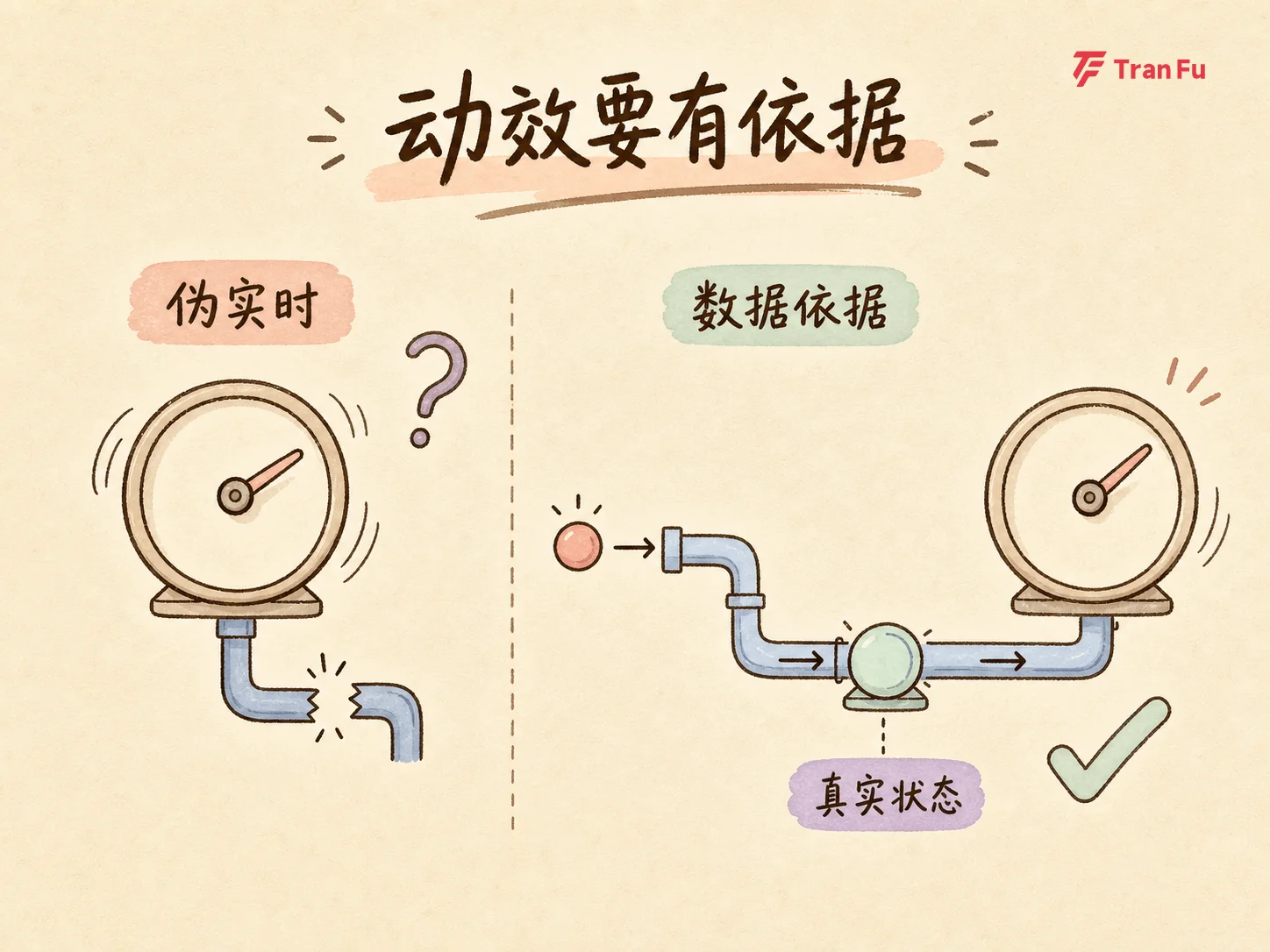
Given this task, the Agent's default answer was to show numbers and make them move: scrolling, increasing, and refreshing in real time. In the generation logic, "data-like" and "data-backed" quietly became the same thing.
Where it almost failed
The issue surfaced during review. On one project homepage, an automatically changing number could easily be understood as real-time business data, even though no verifiable data source supported it. Between "looks real-time" and "is real-time" there is an invisible but very real line.
The design trade-off
The team then had three choices:
-
Change it to a fixed cumulative value
-
Clearly label it as display-oriented
-
Remove it entirely
The same retrospective also had a counterexample: in another project, a number animation was kept because it represented a real status update. Every movement corresponded to an actual data change, so the motion had a clear information task.
The trade-off was never about numbers or animation themselves. It was about credibility without evidence.
Every interface element that "looks credible" must be able to answer one question: what is the evidence? Motion only deserves to exist when it carries information.
Scene 2 | Reject the standard modal and deliver a decision summary
Context and the default answer
Before a user confirms a high-risk, irreversible operation, what should the interface show?
The Agent's default answer was a standard modal: a title, one explanatory sentence, and two buttons, "Cancel" and "Confirm." Preventing accidental clicks is the common form of a confirmation dialog.
Where it almost failed
That default works for low-risk actions. But for a high-risk operation, the confirmation step is the user's final chance to build complete context. A two-button modal pushes the decision burden onto the user's memory:
-
Which records are involved?
-
Who bears the cost?
-
Where will the result be sent?
-
How many steps will the operation be split into?
The design trade-off
The confirmation page was redesigned as a decision summary. Before pressing the button, the interface lays out:
-
Which items are involved in this operation
-
Which account initiates it
-
Which destinations receive the result
-
Whether the operation will be split into multiple steps
The key lesson: generic warnings do not help anyone make a decision. The closer copy sits to an action, the more specifically it must explain that action's consequences.
Information density in critical moments should be determined by the decision, not by component convention.

Scene 3 | Reverse the design order: do not derive the path from the final state
Context and the default answer
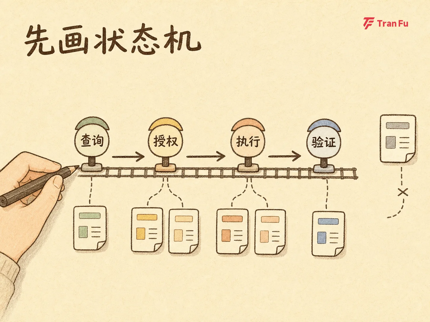
How should you design a page for an asynchronous process involving query, authorization, execution, and verification?
The Agent's default answer was to generate the fully populated default page first: how everything looks when it goes right, then add empty states and error messages backward.
Where it almost failed
The issue was the order of work. The real shape of an asynchronous process is not one page, but a set of states:
-
Querying
-
Empty query result
-
Query failure
-
Waiting for confirmation
-
Submitted and waiting for confirmation
-
Confirmation completed but result not yet verified
-
Partially completed batches
-
Recoverable failure
The default page is only one slice. Deriving the whole flow from that slice inevitably misses cases.
The design trade-off
The order was reversed: draw the state machine first, enumerate the query, authorization, execution, and verification states, and then generate pages from those states. The default page becomes an output of the state machine, not the starting point of design.
This also established a layered principle:
-
Viewing is not authorization
-
Selecting is not execution
-
Confirming is not success
-
A system receipt is not verified completion
Enumerate every way things can go wrong before designing what happens when everything goes right.
The endpoint of trade-offs is rules
These three scenes look different, but they all end in the same action: each trade-off must become reusable.
After stopping a default pattern, the decision is written back as state lists, checklists, and constraints, then fed into the Agent workflow as boundaries for the next generation.
Through this loop, a designer's output shifts from "the answer for a page" to "the rules for judging a page." AI provides polished defaults. Designers decide whether those defaults hold in the specific context, and what to do when they do not.

That is why "what we stopped" is more worth recording than "what we made." Every stopped default expands the boundary outside average-looking correctness.
Generation is fast; judgment is expensive
Back to the beginning: AI can produce a page that looks hard to criticize within minutes.
Speed is no longer the main issue. The real question is: when "perfect" can be mass-produced by models, who can still point out where that perfection does not apply?
The answer is taste and judgment. They may sound like soft skills, but they are hard-won capabilities: accumulated through thousands of concrete moments of "this is not right." They know what is correct on average, and they also know when the specific scene needs something other than the average.

The logic of AI generation is choosing the mode. The logic of taste is making trade-offs. The former is fast; the latter is right.
In the Agent era, the irreplaceable part of design is not hand-crafting pages the old way. It is the ability to look at a perfect page and see what is wrong.
Good production will keep getting faster. Good judgment will keep getting more expensive.